If you find yourself stuck or need a place to start, take a colorful, open and inventive mind for a test drive. Somewhere, maybe just around the first corner, you'll find that elusive "bit" that makes everything come together perfectly. No limits or assumptions will hamper the process, although every thought is sprinkled with taste and style.
My Portfolio -
That "epiphany" may be only a phone call (or e-
don@mindforrent.com
(715) 209-
Home * D'Signs * Drastic Art * D'Fence * D'Portfolio
Custom made Vinyl Stickers, Logos and Graphics, Carved Wood Signs and Artwork for the home or office.
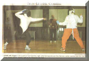
School of the Sword
Western European Martial Arts and Theatrical Training
Join us on a journey of boundless possibility, where the path is paved by your dreams.
My designs go much deeper than just being "pretty pictures". Form and function play the major rolls in the creation of effective ads, signs and logos. Identifying your target audience and appealing to them is crucial. Knowing how they will be receiving the information can change how the presentation should be made. Factors such as viewing time and distance, background clutter and color, visibility in low light or in black and white, create different obstacles when trying to remain consistent with your advertising goal.
 Battling Ignorance and Sparking Imagination
****************************************

Specializing in Design Concepts, Image Appeal and Personalized Advertising.
I can offer solutions and ideas to your advertising problems, helping to get you where you’d like to be
in our fast paced social-
By taking a comprehensive look at what you or your business does, I can create for you an inspirational identity that influences and identifies with your target audience.
Or I could make a cute sign for; the Cabin, a Trailhead, the Guest House , the Garage or his Man Cave, her Room, the Farm… you name it I can make a fantastic sign for it!
Copyright © 2011 MIND FOR RENT Email: don@mindforrent.com
One image can say a lot but not everyone hears the same thing. There is a tricky recipe for combining the picture with the text. The graphic gets them to look and start to reminisce about everything it reminds them of, then the wording takes over and defines it all. The balancing act between the image and text is the essence of a great logo.
Graphics are truly a wonderful thing. "A picture is worth a thousand words" but lets make sure they aren't the wrong words. They can inspire, influence, punctuate, propagate, illuminate, impress and, well, you get my point, they can add quite a lot to what your image is trying to say.


Of course the idea is to catch and keep a clients attention, but many designs get lost in the sparkle and flash, losing the point of the message they were trying to convey. The "eye-
Give me a call! I’ve got more than twenty years of experience making logos, business cards, paper and electronic ads for cable and the web, vinyl window lettering, signs (interior and exterior) from the size of a bumper sticker to highway billboards, graphics for cars and boats, merchant awnings, flags, banners… You name it, more than likely I have experience with installing, using, or fixing it.